
Pizu AI · PROMPT WRITING
You need a coffee product image with room for a headline. You type “beautiful premium coffee photography.” The brief still leaves several decisions open: a cup or a bag, a café or a studio, a close-up or a wide scene—and where the headline will fit.
A useful image prompt describes the picture you need to use. Start with the subject, then specify its position, surroundings, and visual treatment. After generating, revise the instruction connected to the biggest problem you can actually see.
This guide follows one coffee-ad concept from a vague request to a usable brief, then gives you prompts for other situations. Two actual Pizu AI outputs below show how the initial and revised prompts differed. The other prompts are writing examples, not tested comparisons.
A prompt structure you can reuse
[Image type] of [subject and action], in [setting]. Place [subject] in [part of the frame], with [framing or empty space]. Use [lighting] and [materials or color palette]. Include [essential detail]. Keep [important constraint].
You do not need to fill every slot. For a simple avatar, subject and illustration style may be enough. For a banner that must accommodate a headline, placement and empty space become part of the brief.
Google’s Imagen documentation suggests starting with subject, context, and style, then refining the prompt. That is a useful starting structure, rather than a universal formula that every image model interprets identically. Google’s prompt guide.
Work through one image: a coffee launch banner
Before writing the prompt, define the job: a wide banner for a fictional coffee launch, one unbranded bag on the left, and space for a headline on the right. The bag is a concept, so exact packaging reproduction is not required.
1. Replace a mood with a visible subject
Initial request:
A beautiful premium coffee ad, professional, amazing quality.
“Premium” describes a judgment. It does not decide what is in the picture. Write those decisions explicitly:
A studio product photograph of one upright matte cream coffee bag on a dark walnut tabletop, against a plain warm gray background.
This version specifies the object, its material, and its surroundings. It still leaves the layout open. That is the next thing to resolve—not a reason to add more quality adjectives.
2. Write the layout around the intended use
A studio product photograph of one upright matte cream coffee bag on a dark walnut tabletop, against a plain warm gray background. Show the entire bag in the left third of a wide composition. Leave the right half as uninterrupted background for a headline added later.
The added sentences explain where the product belongs and why part of the image should stay empty. “Wide composition” describes the arrangement; it is not a substitute for an aspect-ratio control. Where your tool offers dimensions or a ratio selector, set those separately. Check the actual output size before building the final banner.
3. Add one coherent lighting direction
A studio product photograph of one upright matte cream coffee bag on a dark walnut tabletop, against a plain warm gray background. Show the entire bag in the left third of a wide composition. Leave the right half as uninterrupted background for a headline added later. Use soft light from the upper left, with a gentle shadow falling behind the bag. Show subtle paper texture and muted brown and cream colors. The bag is unbranded; the scene contains only the bag and tabletop.
Now there is a concrete brief to evaluate. The final sentence limits props without adding a long list of unrelated exclusions. Adobe’s Firefly guidance likewise emphasizes specific, descriptive language and revising the wording when a result misses the intended direction. Its guidance is for Firefly; use it as background, not a guarantee about Pizu AI. Adobe’s prompting guidance.
What the two Pizu AI generations actually produced
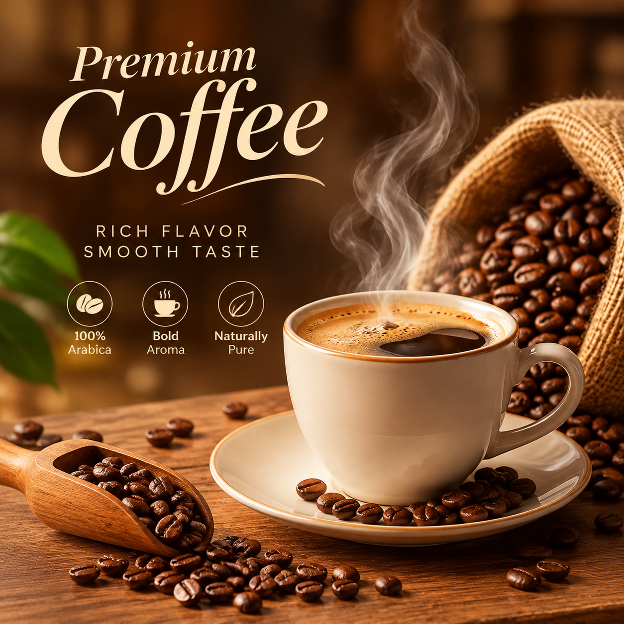
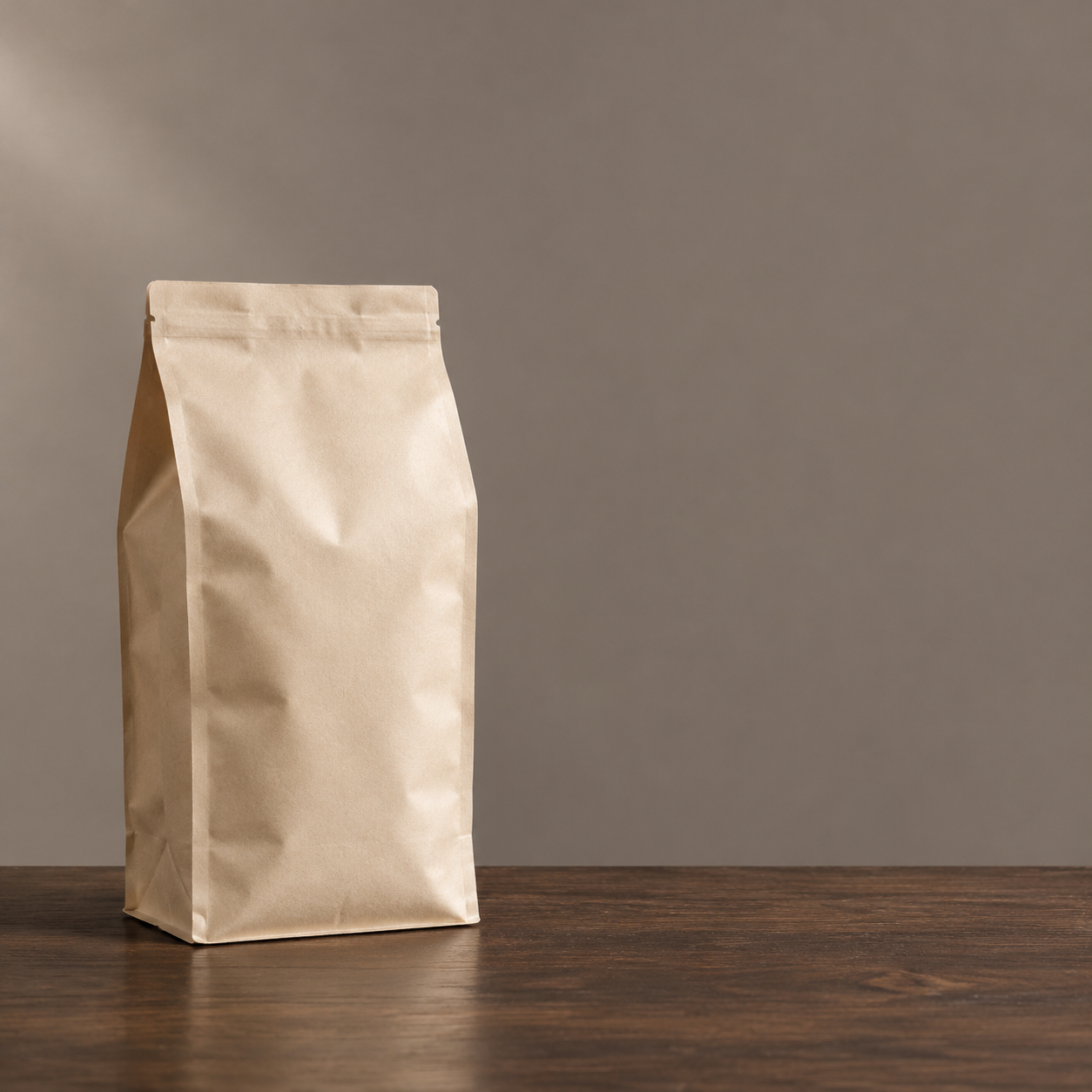
On November 1, 2026, we submitted the initial prompt and the complete revised prompt above through Pizu AI’s image-generation service, using the GPT Image 2 option. There was one generation per prompt, no reference image, and no selection from multiple outputs. The images shown are the original downloaded files, without cropping or retouching. Both files are 1254 × 1254 pixels. The intermediate prompt versions were not generated.
The first result also added “100% Arabica,” which was not supplied in the prompt. This is invented advertising copy, not a verified fact about a product. Review generated claims as carefully as generated spelling before using an image commercially.
The second result follows the requested subject and left-side placement more closely. It is still a square image: asking for a “wide composition” did not produce a landscape file in this run. It would need a layout or crop check before use as the banner described in the brief. This pair illustrates two outcomes, not a success-rate benchmark or a guarantee that repeating the prompts will reproduce them.
Judge the result against the brief
For this banner, check four things before deciding whether you like the overall mood:
- Subject: Is there one bag, fully visible, with a plausible shape?
- Layout: Could your actual headline fit on the right without covering the bag?
- Scene: Are the background and tabletop free of distracting extra objects?
- Finish: Do the bag edges, surface texture, and shadow hold up at the size you plan to publish?
A beautiful centered image can still fail the banner brief. Put the intended headline over the image in your design editor before spending another attempt on subtle color changes.
Fix the largest problem first
Keep the original prompt and note one visible problem. Then replace the relevant sentence. The following are possible revisions, not claims about what a particular model produced.
| What you see | What to revise | What to check next |
|---|---|---|
| The bag fills the image. | “Use a wider view. Show the complete bag with space above and below it.” | Does the product still read clearly at banner size? |
| Props occupy the headline area. | “Keep the entire right half as plain warm gray background.” Remove any earlier prop instructions. | Is the empty area large enough for your real headline? |
| The lighting is too harsh. | Replace the lighting sentence with “Use broad, diffused studio light and soft-edged shadows.” | Are the highlights and shadow edges closer to the intended treatment? |
| The result mixes incompatible looks. | Choose one medium, such as “studio product photograph,” and remove competing illustration or 3D-render instructions. | Is the material treatment consistent across the scene? |
Changing one instruction makes your revisions easier to track. It does not isolate a variable perfectly: a fresh generation can change other parts of the scene too. If you already like a particular result and want to edit that image, use it as a reference where the tool supports reference editing.
When you need your actual product, start from a photo
The fictional coffee bag is suitable for exploring a concept. It is a different task from showing a real bag with a specific logo, label, seam, and package shape.
For an existing product, use a clear reference photograph and describe both the requested change and the details to retain:
Use the uploaded coffee bag photo as the reference. Replace the background with a plain warm gray studio backdrop and place the bag on a dark walnut surface. Retain the bag’s shape, cream packaging, label layout, and logo placement. Leave clear space to the right for a headline.
Inspect those details in the output. A request to retain a label is an instruction, not proof that the label stayed exact. If the final image must reproduce packaging precisely, preserve the original product photograph in a compositing workflow rather than accepting a regenerated approximation.
You can start a new concept in Pizu AI’s AI Image Generator, or use Image to Image when your own photo is the starting point.
Three more prompts, each with a different purpose
A small profile avatar
A flat-color illustration of a black cat with a small white chest patch, facing forward with an alert expression. Head and shoulders only, centered on a plain pale yellow background. Use bold shapes and a simple silhouette that remains readable at a small size.
Why these details: The framing and silhouette support a small display size. If the cat is your pet, supply a photo rather than relying on this description to reproduce its markings.
A bakery social post
An overhead food photograph of three croissants on a round off-white ceramic plate, placed on a light linen tablecloth. Soft daylight enters from the left. Show flaky pastry layers and a few scattered crumbs. Keep the top part of the composition clear for a short caption added later.
What to review: Count the pastries and check whether the plate is comfortably framed. If the layout is wrong, fix it before adding more texture instructions.
A fantasy book-cover concept
A painted fantasy landscape with a small traveler approaching a stone bridge above a mist-filled valley. View the traveler from behind in the lower part of the image. A distant ruined tower is the focal point. Use cool blue-gray mist and one warm light in the tower. Leave the upper area quiet for a title added later.
What to review: Check the visual hierarchy: traveler, bridge, then tower. A dense background may need simplifying even if its details look attractive.
Questions that come up while prompting
How long should an image prompt be?
Use enough detail to settle the decisions that matter to the image. The coffee banner needs layout instructions; a simple avatar may not. There is no word-count target in this workflow. Remove sentences that repeat an idea or introduce a competing direction.
Should I put “8K” in the prompt?
Do not treat it as a file-resolution setting. If you need a particular pixel size, check the tool’s output settings and the downloaded file. Describe the visible detail you want—paper texture, crisp edges, or soft background focus—separately.
Can I use negative prompts?
Support and syntax depend on the model and interface. Do not assume a separate negative-prompt field or another tool’s command syntax works in Pizu AI. In an ordinary text brief, describe the desired scene clearly and keep exclusions relevant to it.
What if the lettering is wrong?
For final ad copy, add the text in a design editor so you can control spelling, spacing, and placement. You can explore generated lettering for a concept, but inspect every word before using it.
For your next image, write down its job before its style. Choose the subject, decide where it belongs, and identify the one part of the result you would fix first. That gives your next prompt revision a specific purpose.